04
Beyond the Looking Glass
Experimental Typography
–
2024
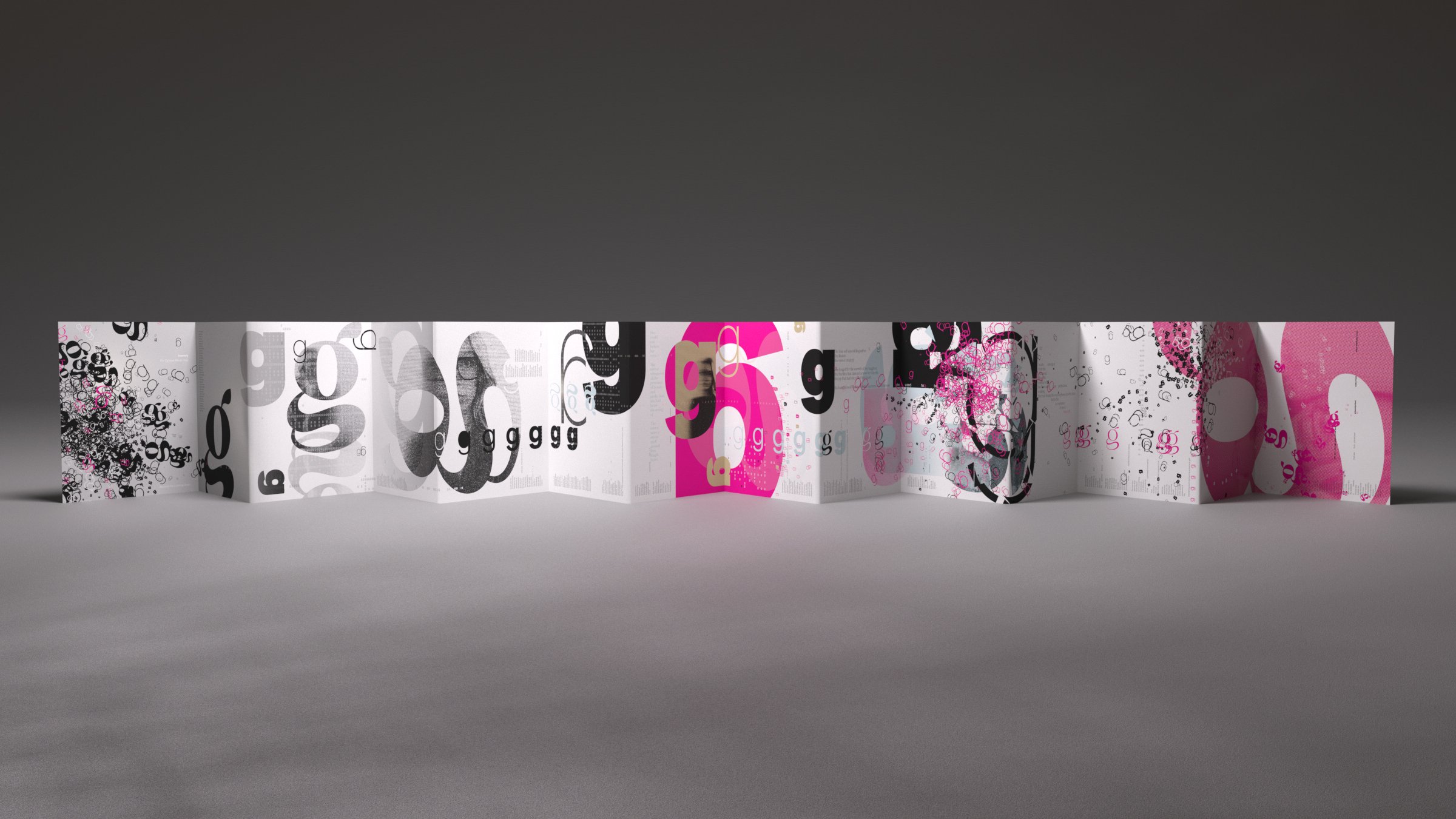
This “book” was gifted to my niece Rudy. The narrative needed to resonate with both young Ru and older Ru, capturing the magic of childhood while imparting a deeper lesson.
This abstract typographic story follows a young girl navigating her journey of self-discovery. In the design, the girl is represented by the lowercase letter "g", starting as a serif to symbolize her natural individuality. As she grows older and yearns to fit in, her obsession with conformity gradually erodes her individuality, transforming her into a sans serif "g". At the peak of the story, she breaks free from societal expectations by shattering a magic mirror, transforming back to serif, now embracing her imperfections. This piece is a story of self-discovery and resilience—one that Rudy can revisit as a guide throughout her formative years.


