05
WIT Retrospective Exhibition
Typography
–
2023
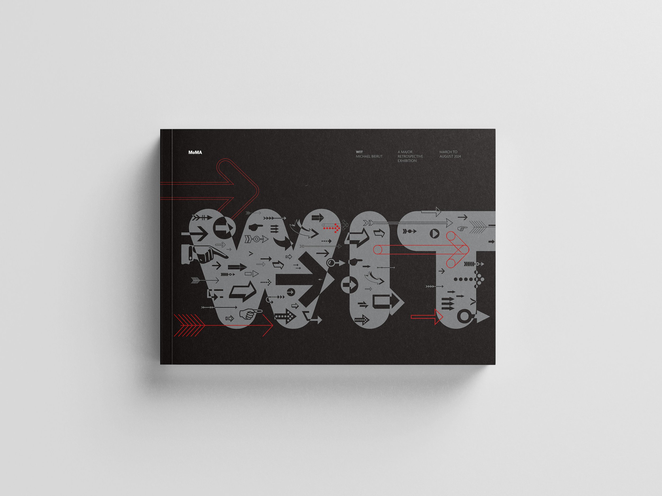
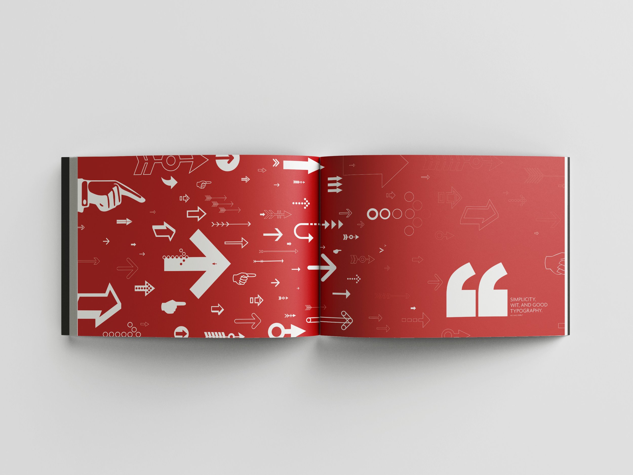
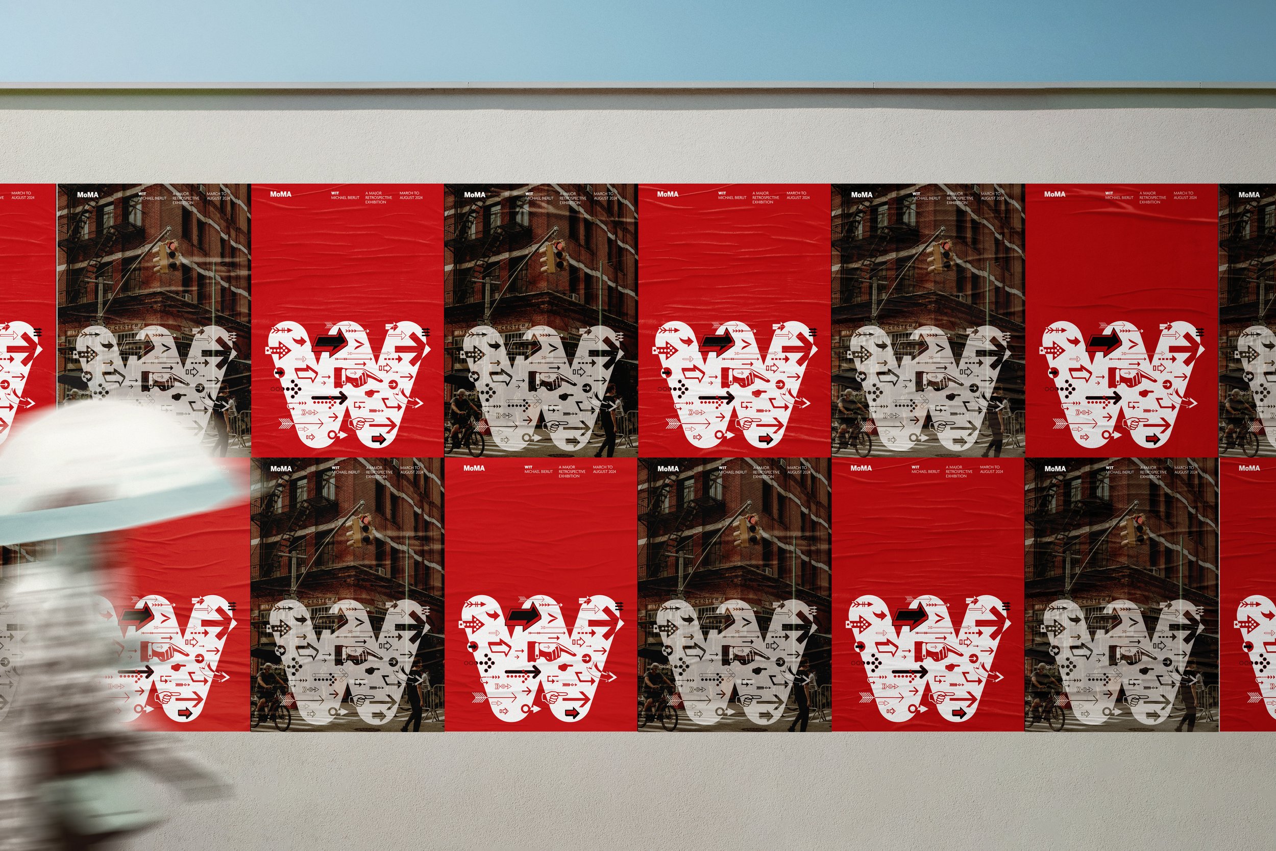
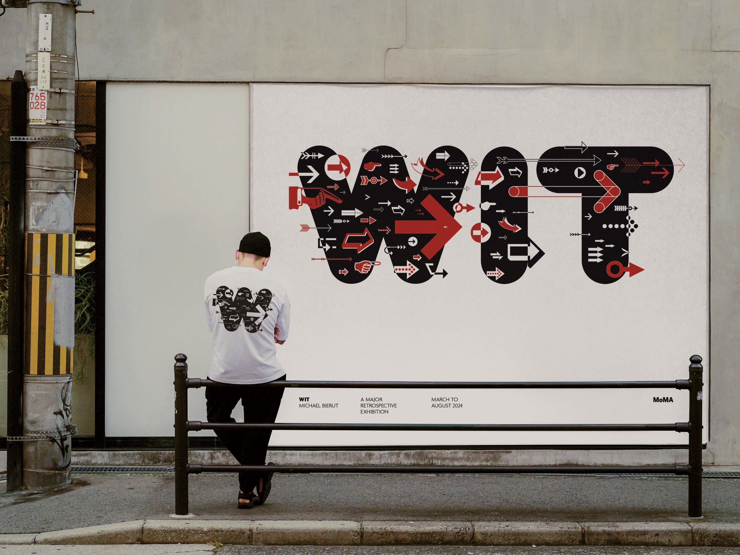
The WIT exhibition showcases the design work of Michael Bierut, focusing on developing a compelling visual language to promote the event. Drawing inspiration from his famous quote, “simplicity, wit, and good typography” and his Yale poster series for the use of arrows. The arrows serve as a central graphic element, bringing movement and direction to the design. This visual language is applied across various formats, including a pitch book, promotional apparel, and posters, blending simplicity with strong typographic elements to ensure a memorable and engaging experience. This cohesive visual language embodies the essence of Bierut’s work, enticing the public to visit the exhibition.


